MMBL X Ideate
Client
UI/UX Lead
Role
Fintech
Industry
2025
Year
Figma, Miro, Google Forms, WCAG Guidelines, Nielsen Heuristics, Maze
Tools
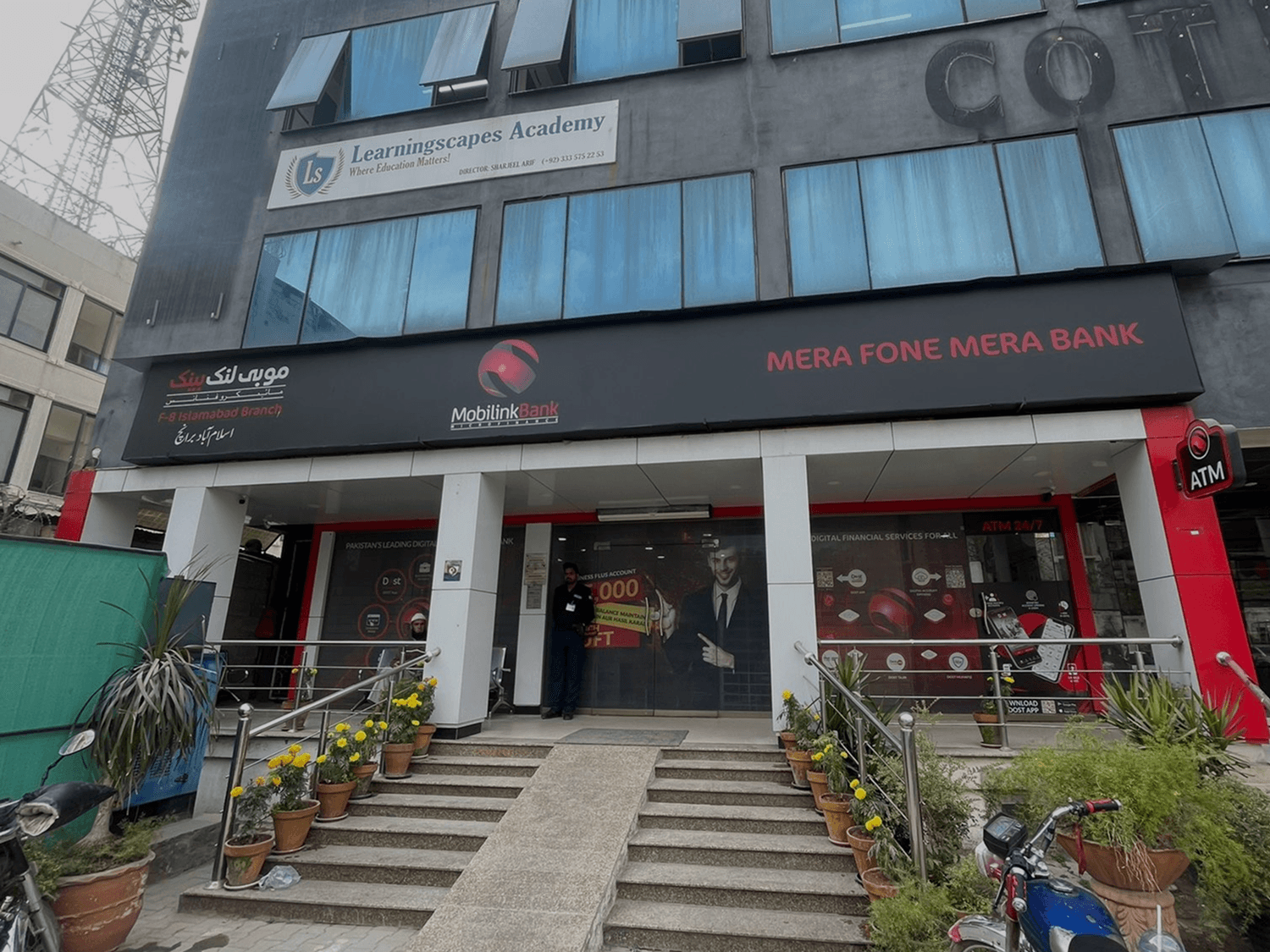
A major microfinance institution in Pakistan sought to improve its mobile banking platform — a critical digital channel for underserved users, many of whom had limited digital literacy or access. Despite its wide reach, the app faced persistent issues: unclear navigation, inconsistent branding, technical friction, and poor accessibility. These gaps eroded user trust and hindered long-term adoption. As the embedded Product Designer and Researcher, I led efforts to ground the redesign in the lived experiences of its primary users — ensuring that the platform became not just more usable, but more empowering.
Goals
Uncover root causes of low app adoption and trust
Design an interface that supports low-literacy users with clarity and confidence
Build a cohesive visual and interaction system aligned with the brand’s mission
Improve accessibility based on international standards while staying contextually relevant
Phase 1: Field Research & Accessibility Audits
To understand real-world use patterns, we conducted in-person studies with over 20 participants across Islamabad — including women, daily wage workers, and SEMEs. These sessions revealed key behaviors and constraints, from shared phone usage to distrust of digital interfaces. I also conducted a full UX and accessibility audit of the existing app, identifying critical gaps using Nielsen’s heuristics and WCAG 2.1 guidelines. This phase highlighted the need for clearer iconography, more forgiving input patterns, and simplified task flows to accommodate a wide range of user abilities.
Phase 2: Synthesis & Strategy
With rich data in hand, we translated findings into actionable personas, journey maps, and service blueprints — all designed to shift internal focus toward user goals, not just product features. These tools helped align cross-functional teams around a unified understanding of user needs and surfaced core tensions between institutional language and everyday usability. The synthesis also informed our prioritization framework for redesigning flows, ensuring that high-impact changes were addressed first without overwhelming development resources.
Phase 3: Iterative Design & Visual Redefinition
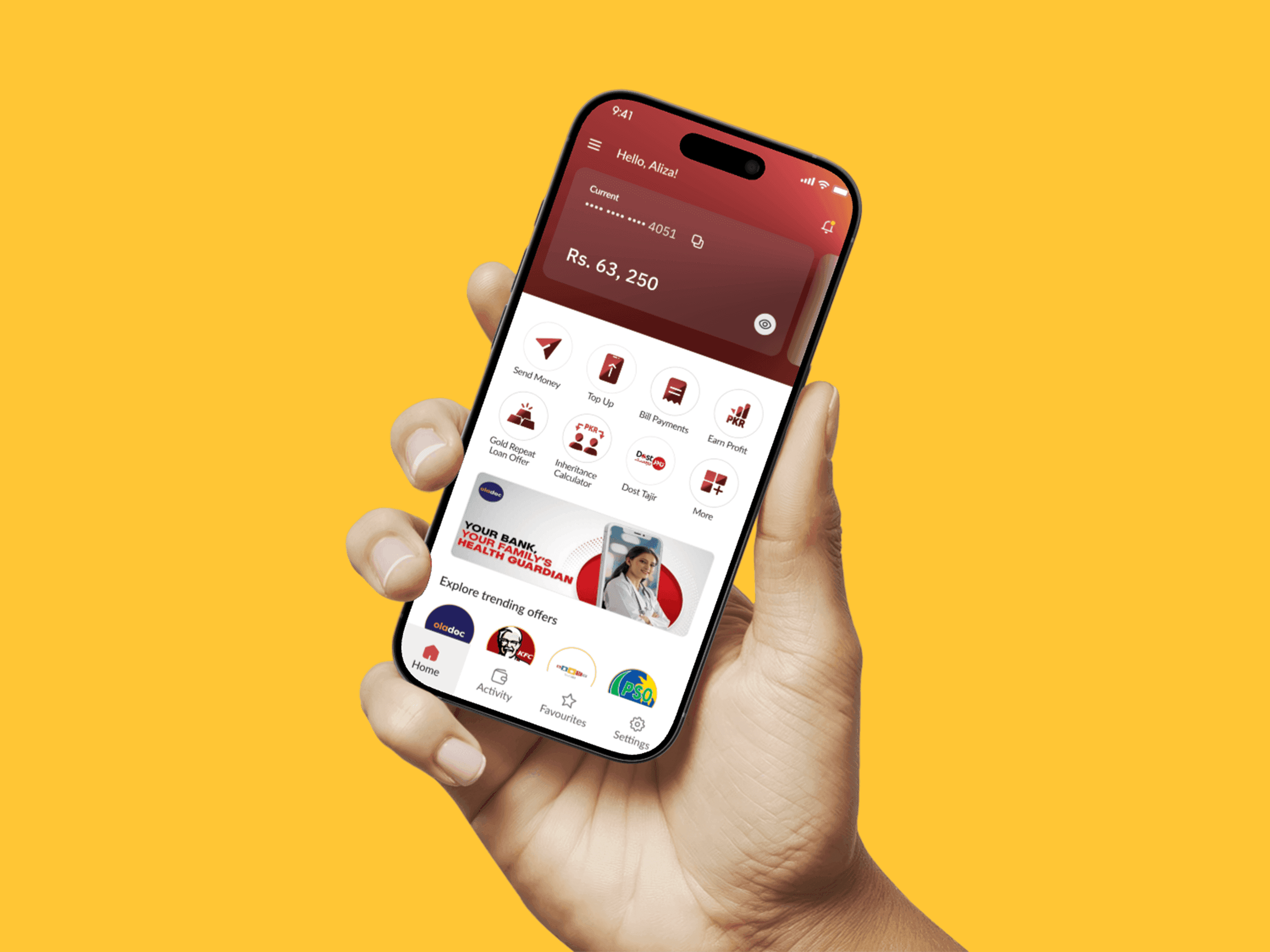
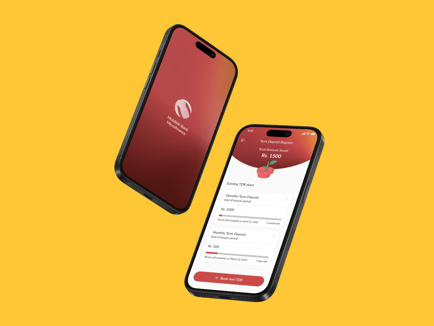
I led the redesign of 10+ core flows, including onboarding, bill payments, and fund transfers. Prototypes were tested in iterative cycles with real users, refining layout, labeling, and interaction patterns based on continuous feedback. At the same time, I developed a new visual identity system that enhanced brand coherence and improved visual hierarchy — using color, contrast, and layout to guide users more intuitively. The final designs met inclusive design benchmarks while resonating with the platform’s diverse user base, from first-time digital users to long-time customers.
This project reinforced the power of inclusive, research-driven design to shift outcomes — not just in usability metrics, but in trust, autonomy, and digital confidence. It also demonstrated the importance of bringing institutions closer to the people they serve, translating systems thinking into tangible, meaningful interfaces.
For me, it was a chance to practice deep design empathy at scale — and a reminder that designing for inclusion is designing for impact.